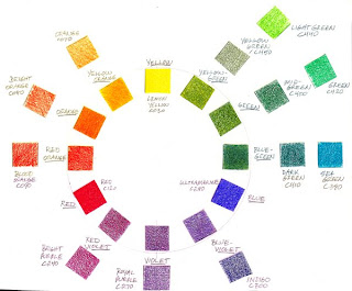
While working with the study of color this month I thought it was time I created a color wheel with colored pencil. Now I have made color wheels with paint, but colored pencil is really an entirely different exercise. Because of the translucency of colored pencil it is perhaps a much more difficult exercise, yet very worthwhile for learning not only how colored pencil "mixes" color but also for understanding just what color palette is available with colored pencils. I am doing this project in tandem with Rose Welty of
Rose's Art Lines and you can see her color wheel "mixing" results
here.
So up top you see my colored pencil color wheel. For the purpose of this exercise I used Derwent's Coloursoft colored pencils primarily because this is the only brand where I own the complete set. My thinking being that with a complete set I should have all the colors necessary to do this type project. Well, not exactly, as I learned.
First off, I identified three pencils to use as my primaries of red, yellow and blue. For red, I used Red c120; yellow, Lemon Yellow co30; and blue, Ultramarine c290. I then proceeded to mix my secondary and tertiary colors using just those three primaries. The complete circle of colors in my color wheel shows the results of these mixes. Although mixing a good violet in any color media is difficult, in this case the red and blue worked quite well. Green turned out to be a more difficult color to achieve, probably because my blue primary leans a little toward the red, resulting in a green with somewhat less intensity. For the sake of comparison I included examples of 'pre-mixed' colored pencils that most closely match the secondary and tertiary colors in my color wheel. By clicking on the color wheel you should be able to see it large enough to read my notations identifying each color used. The oranges were easy enough as were the violet and red-violet to find matches to my 'mixed' colors. The green hues were where I found the Coloursofts very lacking. Nothing is really a good yellow-green, green or blue-green. In each case it seemed a mixture of my two closest contenders would result in better representations of those colors. And a true blue-violet was not to be found, as you can see, my Indigo pencil was the closest, and it is really a different hue entirely.
As a side note, I used at least three different color wheel sources to help me find the correct hues for my color wheel. And even within these three sources there were variations of hue from one color wheel to the next. Color is, after all, very subjective depending on the viewer, the media, and the printing or whatever process is used to reproduce it.

Next up in this exercise is my value scale. Now value, is the relative lightness or darkness of a hue. The lighter values being 'tints', and the darker values are 'shades'. Here I used my blue hue, identified the location of the blue on the value scale, with white at one end and black at the other. I then 'mixed, with either white or black to get my range or seven values. Notice that the blue hue does not fall in the center of the value range, but just right of center toward the darker shades. Where do you think red would be on a value scale? Yellow? Each hue also has its own relative value.

And lastly, my intensity scale. Intensity refers to the relative saturation of a color. To remove or lessen a hue's intensity you can introduce the complement of that hue. In this case I used the complements of blue and orange. And I used the orange colored pencil as opposed to my mixed orange, just to make things simpler and more consistent. The center square is the neutral achieved by mixing the two complements. Changing a color's value with white, black, or gray will also lessen it's intensity. Personally I never use my black colored pencils. I find pure black to be rather deadening in a colored pencil drawing, a holdover from my painting days. Instead I prefer to 'mix' darks, so that even though it may be very dark, there remains some hint of color in my darkest values in a colored pencil drawing.
When I mention 'mixing' color with colored pencils I don't mean mixing in the same way one would mix color in paint. As I stated above, colored pencils apply pigment in a translucent manner that produces a different set of challenges from mixing an opaque media like paint. When layering with colored pencils, it is possible to see the color from the previous layer peeking through as each new layer of color is applied. What is really happening is an optical mixing of color. Your eye blends all those little bits of color into a new color just like all the little dots of color in a newspaper photo blend into the colors you see. Optical mixing of color is challenging but also offers a lot of exciting possibilities for ways to use color, as the Post Impressionist painters discovered. And
Chuck Close used so well.
For further reading about color, how we see colors, and a very thorough explanation of the color terms, hue, value and intensity, check out Katherine Tyrrell's recent post
"Colour-a scientific perspective" on her blog,
Making a Mark.


 Not much art happening for me lately as I have been busy with homeschooling and free-lance work. Hopefully the next few days will offer me more art time. The photo above was taken about mid-morning from our back deck. This is also what it looked like here yesterday. All day. And now today. Snow may be coming too. yippee. So for a little bit of color I tried this quiz that I saw over on Paula Pertile's blog, Drawing a Fine Line.

 Next up in this exercise is my value scale. Now value, is the relative lightness or darkness of a hue. The lighter values being 'tints', and the darker values are 'shades'. Here I used my blue hue, identified the location of the blue on the value scale, with white at one end and black at the other. I then 'mixed, with either white or black to get my range or seven values. Notice that the blue hue does not fall in the center of the value range, but just right of center toward the darker shades. Where do you think red would be on a value scale? Yellow? Each hue also has its own relative value.
 And lastly, my intensity scale. Intensity refers to the relative saturation of a color. To remove or lessen a hue's intensity you can introduce the complement of that hue. In this case I used the complements of blue and orange. And I used the orange colored pencil as opposed to my mixed orange, just to make things simpler and more consistent. The center square is the neutral achieved by mixing the two complements. Changing a color's value with white, black, or gray will also lessen it's intensity. Personally I never use my black colored pencils. I find pure black to be rather deadening in a colored pencil drawing, a holdover from my painting days. Instead I prefer to 'mix' darks, so that even though it may be very dark, there remains some hint of color in my darkest values in a colored pencil drawing.
 Elizabethan Gardens, Manteo NC
 Beach Walk

