Friday, June 27, 2008

Nature Studies


A collection. I realized I hadn't yet posted these sketches. I'm still very busy right now with other work although I am managing to work on a new colored pencil piece as well. I'm just not ready to show it yet so you will have to wait a little while longer. These are all in my small Winsor Newton sketchbook, the one on top is done with walnut brown Polychromo colored pencil, the other two are in graphite. I don't know why I keep getting that pink band along the center, that's just something that seems to happen when I lay this book flat to scan and I haven't figured out how to make it go away.

Lately I have been feeling a lot like the quote from Annie Dillard about sticking a net into time and saying 'now'. These summer days up here in our mountains have been stunningly beautiful. The flowers in our yard are blooming, the vegetable garden is growing, and the dogs and Kiddo are enjoying lots of time outdoors. Kiddo, at 9, is at that age where despite her growing independence she still needs her mom about. And I don't want to miss any of that as I already know how fast things like that can change as kids grow older. But I have lots of ideas to keep me going with my art work and Hubby is enjoying the last of his summer break before he heads back to the classroom for summer courses. Sometimes these long days of summer just aren't long enough.

Monday, June 23, 2008

Pastel Monday

Marsh Trees
pastel on sanded pastel paper
4.5 x 6.5 inches
©Ann Thompson Nemcosky
Click here to buy


Things are still keeping me busy here so I pulled an image from our trip to Edisto Island last spring as inspiration for this pastel drawing. The salt marshes there are lovely and mysterious. I like the textures and colors of the grasses, and the gnarled, weathered trees, all against that still blue water. Little spots like this that look like nothing is going on are probably actually teeming with life just below the surface.

Thursday, June 19, 2008

Paying Attention

graphite in small Winsor Newton sketchbook
quote by Annie Dillard from Pilgrim At Tinker Creek


I've been busy lately but not with art work. Some free-lance design work that I actually get paid for and then the other stuff of life thrown in just to keep me on my toes has been occupying almost all of my time lately. So I decided I'd post this little drawing I did in my nature journal while on my beach vacation last month.

Although getting away and having a break from the usual routine is refreshing, I find I am growing impatient to get back to my art work. We've been taking care of projects around the house, and the free-lance work is good for my pocket book, but I've had a sense of not being in balance. I believe it is coming from missing the time I would be spending drawing, because when I am drawing I am really focusing on something. It's a sustained attention that helps me stay balanced for all the other hectic times throughout the day. And until now I didn't realize how important that routine of drawing was to maintaining my sense of balance.

My calendar tells me that tomorrow is the summer solstice. The days will no longer expand, but begin to grow ever so slightly shorter. A time of turning inward. I am ready. I need to remind myself to pay attention more.


Monday, June 16, 2008

Pastel Monday

Greenway Creek
pastel on sanded paper
6.5 x 4.5 inches
©2008 by Ann Thompson Nemcosky
Click here to buy

This is a scene of the creek along our town's Greenway Trail. The Greenway Trail is a couple of miles long and runs through our town. I don't know the name of the creek, but it's probably actually called a river. Most are around here. We are at the Eastern Continental Divide, where the rivers start. I grew up in Cincinnati. The Ohio, now that's a river. What we have around here will always be just creeks to me.

Wednesday, June 11, 2008

Color!


While working with the study of color this month I thought it was time I created a color wheel with colored pencil. Now I have made color wheels with paint, but colored pencil is really an entirely different exercise. Because of the translucency of colored pencil it is perhaps a much more difficult exercise, yet very worthwhile for learning not only how colored pencil "mixes" color but also for understanding just what color palette is available with colored pencils. I am doing this project in tandem with Rose Welty of Rose's Art Lines and you can see her color wheel "mixing" results here.

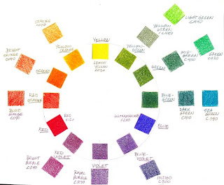
So up top you see my colored pencil color wheel. For the purpose of this exercise I used Derwent's Coloursoft colored pencils primarily because this is the only brand where I own the complete set. My thinking being that with a complete set I should have all the colors necessary to do this type project. Well, not exactly, as I learned.

First off, I identified three pencils to use as my primaries of red, yellow and blue. For red, I used Red c120; yellow, Lemon Yellow co30; and blue, Ultramarine c290. I then proceeded to mix my secondary and tertiary colors using just those three primaries. The complete circle of colors in my color wheel shows the results of these mixes. Although mixing a good violet in any color media is difficult, in this case the red and blue worked quite well. Green turned out to be a more difficult color to achieve, probably because my blue primary leans a little toward the red, resulting in a green with somewhat less intensity. For the sake of comparison I included examples of 'pre-mixed' colored pencils that most closely match the secondary and tertiary colors in my color wheel. By clicking on the color wheel you should be able to see it large enough to read my notations identifying each color used. The oranges were easy enough as were the violet and red-violet to find matches to my 'mixed' colors. The green hues were where I found the Coloursofts very lacking. Nothing is really a good yellow-green, green or blue-green. In each case it seemed a mixture of my two closest contenders would result in better representations of those colors. And a true blue-violet was not to be found, as you can see, my Indigo pencil was the closest, and it is really a different hue entirely.

As a side note, I used at least three different color wheel sources to help me find the correct hues for my color wheel. And even within these three sources there were variations of hue from one color wheel to the next. Color is, after all, very subjective depending on the viewer, the media, and the printing or whatever process is used to reproduce it.

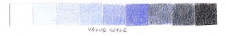
Next up in this exercise is my value scale. Now value, is the relative lightness or darkness of a hue. The lighter values being 'tints', and the darker values are 'shades'. Here I used my blue hue, identified the location of the blue on the value scale, with white at one end and black at the other. I then 'mixed, with either white or black to get my range or seven values. Notice that the blue hue does not fall in the center of the value range, but just right of center toward the darker shades. Where do you think red would be on a value scale? Yellow? Each hue also has its own relative value.

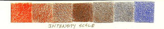
And lastly, my intensity scale. Intensity refers to the relative saturation of a color. To remove or lessen a hue's intensity you can introduce the complement of that hue. In this case I used the complements of blue and orange. And I used the orange colored pencil as opposed to my mixed orange, just to make things simpler and more consistent. The center square is the neutral achieved by mixing the two complements. Changing a color's value with white, black, or gray will also lessen it's intensity. Personally I never use my black colored pencils. I find pure black to be rather deadening in a colored pencil drawing, a holdover from my painting days. Instead I prefer to 'mix' darks, so that even though it may be very dark, there remains some hint of color in my darkest values in a colored pencil drawing.

When I mention 'mixing' color with colored pencils I don't mean mixing in the same way one would mix color in paint. As I stated above, colored pencils apply pigment in a translucent manner that produces a different set of challenges from mixing an opaque media like paint. When layering with colored pencils, it is possible to see the color from the previous layer peeking through as each new layer of color is applied. What is really happening is an optical mixing of color. Your eye blends all those little bits of color into a new color just like all the little dots of color in a newspaper photo blend into the colors you see. Optical mixing of color is challenging but also offers a lot of exciting possibilities for ways to use color, as the Post Impressionist painters discovered. And Chuck Close used so well.

For further reading about color, how we see colors, and a very thorough explanation of the color terms, hue, value and intensity, check out Katherine Tyrrell's recent post "Colour-a scientific perspective" on her blog, Making a Mark.

Sunday, June 8, 2008

Weekly pastel

Blue Ridge Summer
pastel on sanded pastel paper
6.5 x 4.5 inches
©2008 by Ann Thompson Nemcosky
Click here to buy


My intention is to post these pastels on Mondays, so I am a day early here. Oh well. It's all because I know the start of my week will be very busy and I probably won't have much computer time.

Still working on my color project though. Doing this pastel was a nice break however. It is a view from the Blue Ridge Parkway, not far from here, in the height of summer, haze and all.

Saturday, June 7, 2008

Color Sense

Marsh Spring
6.5 x 4.5 inches
colored pencil on paper
©2008 by Ann Thompson Nemcosky


Here is a colored pencil drawing that I did a while ago, from our trip to Edisto Island, SC, last March. I was taken with the color of the marshes, how they not only change with the seasons but also change depending on the light and time of day. Bits of water reflecting the sky punctuating the multi-hued grasses provide a play of color and texture.

My first week of my garage "painting workshop" has been okay. Not astounding, but it has been revealing to me on several levels. What I am most struck with is the realization that what I 'know' about color and what I actually do with color are two different things. Just like drawing requires a constant practice of seeing shape, value, and texture, successfully working with color also depends a lot on constant practice. In order to use color on my terms rather than relying totally on what my reference is telling me I know I need much more practice cultivating my awareness of color.

For those of you who do work more with interpretative color, how do you keep your color senses sharp? I would be interested in hearing. I'm sure there are as many methods as there are artists.

Anyway, I'm not sharing any painting results just yet. Maybe after I've been at it a little while longer.

Tuesday, June 3, 2008

Color project for June

Elizabethan Gardens, Manteo NC
colored pencil in Moleskine sketchbook
©2008 Ann Thompson Nemcosky


For the month of June I have been given the gift of time. Something that is a rare commodity and always in great demand in my day-to-day activities. It comes in the form of a few hours three mornings a week while my dear hubby will be taking kiddo to her tennis lessons. Come July he's back in the classroom and I'll be on duty again from there on out. The rest of my days will chiefly be occupied with homeschool lessons (yes, we school year round - believe me, it's loads easier) and all the other stuff moms need to do. But for the next four weeks, those morning hours will be mine.

And that's what gave me an idea to do a special project, something I have wanted to do yet didn't have the time to accomplish - paint. I haven't really attempted to put paint to canvas in over nine years. Besides, I have many ideas in the works for new projects in colored pencil. I wavered over the sense of this project, to indulge myself with painting, when I could very easily fill that space of time with so many worthwhile activities. My kitchen cabinets are screaming to be scrubbed and our attic is a nightmare of clutter. Or I could continue with my colored pencil drawing projects, getting oh so much accomplished. Then I saw this post about color from Katherine Tyrell on her blog, Making a Mark.

Well, that did it. I have committed myself to a month of working in paint. I spent the day setting up a temporary "studio" in our garage, the only available space in our little mountain cottage suitable for making a mess. Since the weather is warm, working there will not be a problem, and I added a couple of clip-on lights to brighten it up. I already had a good supply of paints and brushes and a quick trip to the art supply store filled any holes I had in supplies.

Katherine Tyrell's extensive outline for her color project is very inspiring and something I will be following very closely as I dive into my paints. And my goals for this project? I would like to see if I can come away from my own personal painting workshop with a better sense of how to use color more interpretatively than representationally. When I do return to my colored pencil drawing I would like to be comfortable with a more expressive rather than a literal use of color.

I do still plan to continue with drawing in all my various sketchbooks. Whether I will share any of my paintings here remains to be seen. It all depends on how things go. Stay tuned. . .

Monday, June 2, 2008

Pastel Monday

Summer Field
6.5 x 4.5 inches
pastel on sanded pastel paper
©2008 by Ann Thompson Nemcosky
Click here to buy


This image is a scene just down the road from our house, captured on a morning walk. It feels good to be getting back into the routine of things after our Outer Banks vacation. Summer has arrived here in our mountains and my summertime projects are waiting. Our little vegetable garden is planted with tomatoes and basil and I spent Saturday afternoon reclaiming my small herb garden. But there is still a neglected flower bed to tend to as well as much housekeeping to be done. The birds wake us in the morning with their dawn chorus coming through now opened windows. The insects are chirping and the bull frog calls from the creek across the road. Every thing is noisily busy these days and I need to get to work.

LinkWithin

Blog Widget by LinkWithin