A recent page from my sketchbook with a quick sketch of my lilac blossoms and a quote that I liked for trying out a new pen. The pen is okay, it's an Elegant Writer pen, but not waterproof so I don't know how useful it will actually be for me. It may get added to Kiddo's stash of marking pens.
I have been thinking lately about the purpose of my sketchbook journals and how that fits with things that I would like to try out. Are my journals about the finished pages or are they about the thinking process, working out ideas? Actually they are both, and there are many pages which you never will see. And there are pages like this that are part experiment, part record of daily life. Sometimes I think that maybe I should have a "messy" journal along with this sketchbook journal. Laura Frankstone had an interesting post on this topic a few weeks back on the Artists' Journal Workshop blog. And I do feel about journals much they way she does. I greatly admire other artists' beautifully designed sketchbook journals but mine do remain more organic, more messy, for the most part. How do you approach your sketchbook journals? Do you separate the journals for more "finished" pages from a "messy" journal? Or let it all happen together?
Tuesday, April 26, 2011
Saturday, April 23, 2011
Marsh Walk
Marsh Walk
oil on canvas
6 x 6 inches
©Ann Thompson Nemcosky
Here is #57 of my 100 painting project. It is a another view of the marshes at Botany Bay on Edisto Island, SC. Remember when I did the thumbnail exercise? This is the first painting the sprung from that process. I have noticed that the further away I get from the original reference, the more I work in terms of color, as in color field painting. A move toward abstraction? I don't know. I may just have to find out though.
Tuesday, April 19, 2011
Sketchbook Tuesday - sketching spring
Last Friday was a typical spring day here in our mountains. The thermometer was trying hard to reach 60 degrees F, it was overcast and quite breezy. A friend had organized a sketch outing for our girls and ourselves so off we went to a nearby park. With the breeze, papers had to be weighted down and even palettes wanted to blow over. When the girls tired of sitting still sketching they ran off and played kick ball. My friend and I shivered under layers of sweaters and jackets but managed to get some sketching in. Above is my attempt. A sketch with a brown colored pencil, filled in with watercolor and finished off with more brown colored pencil.
Saturday, April 16, 2011
Marsh Song
Marsh Song
oil on canvas
6 x 8 inches
©Ann Thompson Nemcosky
Here is #56 of my 100 painting project. It is a view of one of the marshy areas surrounding Botany Bay on Edisto Island, SC. It is such a serene place to visit, unspoiled by development and with a very rich history. Many of my paintings have been inspired by this place, and I suspect there will be more. (Ironically, when looking for a good link to more information about Botany Bay, the best one I could find features a photo that looks to be taken in the same location as my painting above. So now you have to check that out!)
Tuesday, April 12, 2011
Sketchbook Tuesday - again!
Yeah, I am going to try posting sketches regularly on Tuesdays again. Having a schedule is a good motivator. Something predictable and sure. We'll see how it goes.
So here is a sketch I did last week on one warm and sunny afternoon. I sat on our back deck, turned so that I could see the drive and side yard, and sketched our blooming forsythia while enjoying the sunshine. Most of our yard is wooded, with an understory of Rhododendrons, which provide a nice, rich green backdrop to the bright yellow of the forsythia blossoms. For this sketch I began with Prismacolors, my new favorite, "Espresso", and an old favorite, "Chestnut", to sketch in my scene. Somehow the pencil lines don't intimidate me the way ink lines do. Then I put in the watercolor and finished off by re-stating some of the pencil marks.
Now I have noticed that our recent rains have knocked most of the blossoms off of the forsythia. And it's supposed to get cold again. Winter still has a foot in the door here but spring still comes with determination in its own good time.
So here is a sketch I did last week on one warm and sunny afternoon. I sat on our back deck, turned so that I could see the drive and side yard, and sketched our blooming forsythia while enjoying the sunshine. Most of our yard is wooded, with an understory of Rhododendrons, which provide a nice, rich green backdrop to the bright yellow of the forsythia blossoms. For this sketch I began with Prismacolors, my new favorite, "Espresso", and an old favorite, "Chestnut", to sketch in my scene. Somehow the pencil lines don't intimidate me the way ink lines do. Then I put in the watercolor and finished off by re-stating some of the pencil marks.
Now I have noticed that our recent rains have knocked most of the blossoms off of the forsythia. And it's supposed to get cold again. Winter still has a foot in the door here but spring still comes with determination in its own good time.
Friday, April 8, 2011
Something a little different
Early Spring
mixed media on paper
4.5 x 6 inches
©Ann Thompson Nemcosky
This is a little mixed media experiment that I worked on last weekend. While browsing art blogs last week I came across a post on one of my favorite artists blogs, Vivien Blackburn's, Paintings Prints and Stuff. Her work posted, "A muddy lane in February" immediately caught my attention. I have long been a fan of her art and was intrigued by her explanation of process with this work. So I tried my own version using a reference of an early spring scene I had photographed while on a walk in a local park.
I used a spare piece of Canson Edition paper and began with Neocolor II crayons, sketching in areas of color. This I brushed with water and let dry. Then I went in with colored pencil, adding some of the smaller elements and softening the intensity of the Neocolor washed a bit. After that I added pastel, bringing up some of the lights and then more colored pencil to define some of the details.
This was a fun way to work with much more immediacy than using colored pencil alone. What I like about Vivien's piece is the softness combined with the expressive marks, allowing for a quiet energy in her piece. And this is where I feel my mixed media falls short. Perhaps it's a fear of pushing the media. Of course this is only one of very few attempts I have done with mixed media. It is a method I would like to explore further, but probably not any time soon. For now, I'll remain content enjoying Vivien Blackburn's beautiful art works.
Labels:
colored pencil,
landscape,
mixed media,
neocolor II,
pastel
Tuesday, April 5, 2011
Inspiration and grief
Yes, I am still here. We have had a tough time these past few months with my father-in-law's illness and passing a couple of weeks ago. I did manage a few sketches but have found it difficult to return to a working rhythm due to the sadness overshadowing our days. I know some artists are able to find solace in their art but I couldn't seem to get there. Yet when I think about the kind of person my father-in-law was, I know I should look to his influence for guidance. He wasn't one to sit around. He was always on the go, always busy, out there doing. I feel privileged to have had him in my life.
So here are a couple of sketches from my spring journal, although I haven't been happy with any of them so far. The top sketch is of a jade plant that belonged to my mother-in-law and stayed in her lovely sunroom, cared for after her passing for years. It lives in my house now, in a brand new flowerpot. And a trip to the grocery often results in subjects for inspiration, as with the peppers above. Spring is coming slowly to our southern mountains. I am so looking forward to warmer days with loads of blooming inspiration.
Monday, March 14, 2011
Checking in
A short post today just to check in and let you all know that I haven't forgotten my blog here. We were away last week and then Kiddo and I came down with a flu bug. We are home now and recovering. I did manage one quick sketch while away but you know, there's no place like home really.
I also want to thank everyone for your so very kind and encouraging comments left on my last post. Your generous words mean a lot to me. I'll be back at the drawing board with something new soon.
Sunday, March 6, 2011
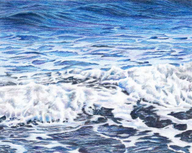
Ocean Blue
Ocean Blue
colored pencil on Rising Museum Board
7.5 x 9.5 inches
©Ann Thompson Nemcosky
Here it is, all finished. I have been looking at it for a couple of days now and am going to leave this one as it is. I am happy with the final result and I would like to do a few more ocean drawings. Every time we are at the beach I use up a ridiculous number of pixels taking pictures of the water and waves. I get captivated with the way the surf moves, expanding and contracting, out and in, and the patterns that are formed as each wave washes the shore. And the way the light at various times of day plays off the water, it's always something different to see. The last time we were at our favorite Edisto Beach the water was an amazing blue, like I had never noticed before. That is what I hoped to capture with my photos, and translate into this drawing. That incredible blue.
And just to show you, this was one of the stages as the drawing was nearing completion. I used ten different blue pencils, along with two purples, a pink, and a warm and a cool gray. As I was developing the darkest areas in the foreground I discovered that even my indigo blue wasn't giving me the depth in those darks that I wanted. So out came one of my favorite pencils, caput mortuum violet. You can see where I began adding it in the lower right portion of the image above. It did the trick too, by deepening and warming those dark areas just enough.
And here it is again in its final state, same as the image at the top. Thanks for following along as I worked on this one. All of your kind and encouraging comments are so appreciated and help keep me going! Now, what should I draw next?
Tuesday, March 1, 2011
Getting there
Here is my current colored pencil piece, through the next couple of stages. Above you can see where I started getting into that area of the water where the foamy bits begin. The contrast in this area is more stark and pattern like but I had to keep in mind that even though those shapes of foam are very light, they are not the brightest parts of the composition.
Now here is where the tricky part of the drawing begins to emerge. At this point I was really beginning to question the wisdom of my choice of subject matter and my sanity in trying to draw all of this foamy water splashing on the shore. There is little defining shape and the contrast of light to dark areas is much more subtle. I am going to continue on with the darker passages in the foreground (that are just barely blocked in at this point), and then go back to make adjustments in the foamy surf. I will need the reference of those darkest passages where the water washes over the shore in order to see how the values in the rest of the piece should relate to those darkest darks. It's a lot of going back and forth with color and value, but it's slowly getting there!
Subscribe to:
Posts (Atom)