Friday, May 27, 2011

Let's Draw a Pear! - Steps 3 & 4

Today's post continues with our pear tutorial begun in the last post. Click here in case you missed steps 1 & 2. Or go to my Tutorial page and follow the links to download a copy of the entire tutorial, Let's Draw a Pear!, in PDF.

Step Three : A list of materials used to make this drawing

Here are the supplies that I used to make this drawing of a pear. For my support (paper or other surface for applying art media) I used my favorite Rising Museum Board. It has a slight texture and a somewhat firm surface. This allows for lots of layering of the colored pencil. Another good support for colored pencil work is Strathmore Bristol Vellum 500 Series. It has similar characteristics to Rising Museum Board and provides a very suitable surface for colored pencil.


The other items I used were tracing paper, artist’s tape, a mechanical pencil, pencil sharpeners, kneaded erasers, and a white plastic eraser stick.


The colored pencils that I used for this pear drawing were all Faber-Castell Polychromos colored pencils. I used the following colors (in this order):


Light Chrome Yellow, Light Yellow Ochre, Brown Ochre, Sanguine, Light Green, Cadmium Yellow, Cadmium Yellow Lemon, Light Cadmium Red, Cadmium Orange, Burnt Carmine, Burnt Umber, and Dark Indigo.

Faber-Castell Polychromos colored pencils are often available as open stock from art supply retailers.

Step Four : Transferring the image to the drawing surface
Mark your drawing support for a 5 x 7 inch format.  Place tracing paper over the photo reference and mark the corners. Trace the outline of the pear shape and shadow with pencil. Other than the pear’s shadow, we are not concerned with any of the background. If it is too difficult to see the shadowed edge of the pear against the dark back ground through the tracing paper, draw that edge with a white colored pencil directly on the printed out photo reference.

Turn the tracing to the back side and draw along the pear shape with a soft lead pencil.

Now place the tracing right side up over your marked drawing surface, lining up corners and tape the tracing paper to the drawing paper at the top.

Draw over the pear shape outline with a pencil, careful not to press down too hard. Using a heavy pressure will impress lines into your support. Now the outline of your pear shape should be transferred onto the drawing support.

Monday's post will show the first stages of the colored pencil layering techniques in Step 5. Hope to see you there!

Thursday, May 26, 2011

Let's Draw a Pear!

Pear
colored pencil on Rising Museum Board
5 x 7 inches
©Ann Thompson Nemcosky

I am trying something new on my blog. I have put together a tutorial for doing a colored pencil drawing of a pear and will be posting the steps throughout the next week. I invite you all to not only follow along, but if you would like to give the drawing a try yourself, please let me know in the comments with a link to where you are posting your results. I would love to follow along with your progress too!

Also, if you would prefer to work from a paper copy of the tutorial you can visit my Tutorial page here on this blog and follow the links to a free PDF file that you may download for yourself.

Today I will begin with the Introduction and steps 1 and 2, just to get you started. Have fun!
___________________


 There are as many different ways to draw with colored pencil as there are colored pencil artists. Drawing still life objects is always a popular subject and one which lends itself well to the medium of colored pencil.

In this tutorial you will see the process that I follow for drawing a still life subject in colored pencil, from setting up and photographing the subject to the finished drawing.

The steps outlined here for drawing this pear are
  •   Taking a good photo reference of the pear 
  •   Adjusting the photo and creating the composition in Photoshop
  •  A list of materials used to make this drawing
  • Transferring the image to the drawing surface
  • Applying colored pencil in layers to create form and depth of color
  • Using a kneaded eraser as a drawing tool to create texture
  • Putting the final touches on the drawing
Step One : Taking a good photo reference of the pear
Here is my usual set up for photographing still life objects. I use indirect, natural light coming in through our back door with a white painting board balanced on top of a small pedestal table. I place my still life object on the white board and photograph from many angles with the object(s) in various positions. I never use a flash for these photos as a flash will wash out the light and shadow. 

I have used black denim fabric when I want a dark background for my object but my preferred surface is this white laminate board. It reflects a bit of light and nicely catches the shadows from the objects.

Though I do have to be careful that my “assistant” doesn’t confuse my still life set up for his snack!

Step Two :  Adjusting the photo and creating the composition in Photoshop
This is how the photo I chose to use for my reference appeared straight out of the camera. I liked the position of the singular pear including the turn of the stem. I also saw that it had a good value range from light to dark, a nice distribution of color and interesting highlights and shadow.
 
Next,  I made my adjustments to the photo in Photoshop. First I cropped the photo to my desired 5 x 7 inch size, centering the pear within the format. I then used the auto levels and auto color functions.  I increased the saturation by 15, the brightness by 30, and the contrast by 15. I applied the unsharp mask with a setting of 50%, radius 1.0 and threshold 0. 

I printed out a copy to check the result. Because pictures always seem to print a little dark on my printer,  I went back and increased the brightness setting by 12 and printed out my reference again.  If all of these settings and numbers are unfamiliar or confusing, don’t worry. Basically, I cropped the image to its desired size, adjusted for contrast, increased the brightness and color saturation, and sharpened the image. All of that took my okay picture and created a very acceptable reference photo.

Below is the final reference photograph ready for you to print out and use for your drawing of the pear.
 Click on the photo to open a larger size. Hopefully it will print as a 5 x 7 inch photo for you!

Friday I will post steps 3 and 4. Stay tuned!

Wednesday, May 25, 2011

Sketchbook Tuesday - It's Wednesday, I know

I was all set to post yesterday only to find that a glitch with blogger was preventing me from signing in. So my planned posts for this week are a little backed up, but there it is.

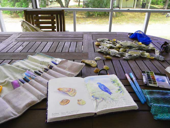
We spent last week at Edisto Island, SC, our favorite get-away. The weather couldn't have been more perfect. We had fun playing on the beach, wonderful meals, and the company of a good friend. And we all enjoyed spending some time with our art. Above is a sketch of a few found shells, in my handmade sketch journal.
The screened porch was my favorite sketching spot at our little rental cottage. Every morning we were visited by a pair of bluebirds that would sit happily singing on the utility wire that ran in front of the cottage, in perfect view of the screened porch. I imagined that was a good omen for our stay.
 We spent one afternoon on the sound side of the island with our watercolor gear. I took my small watercolor kit and a few watercolor postcards instead of my sketch book. It was a good thing too. The wind was very strong, blowing sand onto everything, sticking in the paint and on the paper. I did this quick little sketch with an indigo colored pencil filled in with a watercolor wash.
 And I couldn't leave Edisto without sketching a palm tree. Along with the huge live oaks decorated with Spanish moss, the palmettos are a part of the charm that is Edisto.

Tuesday, May 17, 2011

Sketchbook Tuesday - Down by the river

We managed to get out for another sketch outing last week, this time to the park in Valle Crucis. It was nice sitting in the sunshine by the river but the bees were out. I did this quick sketch in my handmade sketch journal, while warding off curious bees.

Friday, May 13, 2011

It takes practice


Daniel Boone Gardens in Summer
watercolor on 140lb. Kilimanjaro cold-pressed
6 x 8.5 inches
©Ann Thompson Nemcosky

One project that I am currently working on is watercolor practice. Lately, the only time I use watercolors is for sketches in my sketch journal. I would like to continue to improve with watercolor, so I picked up a nice watercolor block and a couple of new brushes and have begun a regular (sort of) practice. The image above is the result of a practice session. It felt good to be working on nice watercolor paper and in a size larger than my usual journal format. If this scene looks familiar to you, it's because I have also used it for a colored pencil piece, here.

Tuesday, May 10, 2011

Sketchbook Tuesday - Finally it feels like spring

We have had some gorgeous spring weather lately. It's finally warming up and we've had a chance to get out and do some sketching. Yay! This is a view from the Blue Ridge Parkway, not too far from our house, done in watercolor in my handmade sketchbook.

And thank you for the thoughtful comments on my last post! I suppose that like you all, I too, tend to work on more than one project at a time. If I had the space and time I'd probably have even more projects going simultaneously. But that might be dangerous. For now, I am trying to keep my focus on just a few key interests and see where they take me.

Thursday, May 5, 2011

A New Light

A New Light
oil on canvas
6 x 6 inches
©Ann Thompson Nemcosky

Here is #58 of my 100 painting project. Another view of the marshes on Edisto Island, South Carolina. With the coming of summer my time is beginning to open up a bit. So I am thinking of ways to take the best advantage of the extra hours. What 'projects' do I want to pursue? Where do I want to put my focus? I already have enough ongoing projects to keep me busy for a very long time. But new ideas keep popping into my head as well. I suppose I need a better filtering system. How do you prioritize your various creative projects? Do you work on more than one at once or do you tackle them one at a time?

Tuesday, May 3, 2011

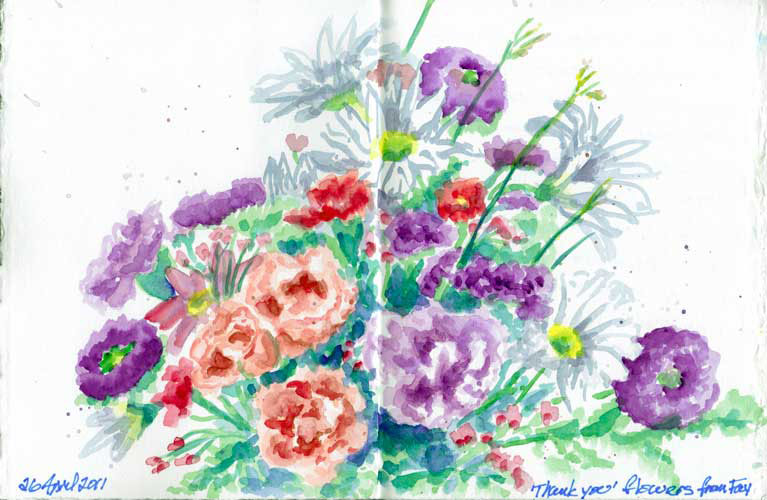
Sketchbook Tuesday - more flowers and other thoughts

I was without internet for a few days, so I didn't get around to posting again last week. And here it is, another Tuesday, and another watercolor sketch of flowers from my handmade sketch journal.  Thank you to everyone who commented and contributed to the discussion on my last post about how you approach keeping a sketchbook. It seems many are like me, preferring to keep everything in one place, the messy, quick sketches and notes right along with more finished sketches. The idea of keeping a separate sketchbook or books, for various intentions really appeals to me. But in reality I doubt that, at this point in time anyway, that method of organization would make me happy. What I have been doing as a sort of compromise is to create my sketchbooks with my own style of organization. Along with the signatures of Canson Edition paper for my sketches I include a signature in the front and back with plain copy paper. It is there that I put my jumbled notes to myself, record passages from my reading, and even have photocopied calendars pasted in. This helps me keep it all in one place. And like Jennifer Rose commented, I would feel so lost without my sketchbook!


I had jotted down a line from Robert Genn's newsletter last week, "Less commitment widens opportunity." This is something I have been thinking about lately. Letting go of self-imposed "commitments" in order to be open to whatever form inspiration shows up in. I'm a list-maker, and a goal-setter by nature yet I am finding that lately my life either isn't allowing for that or simply that it's time for another approach. Leo Babauta of Zen Habits talks a lot about goals and why they aren't as important as we think. That without goals we can be more open to possibilities we may not have foreseen. So I am changing my thinking from being goal oriented to project based. With a goal, you are looking at the desired end result before you even begin. With a project you are setting up a starting point which allows the work to take you where ever your interest leads. That's how it is with my journals. If I separated out intentions or goals for different journals it would feel too confined to me. Knowing me, there would be way too much overlap, and I am easily confused. And it has become the same with my other art works. If I am focusing on the "goal' I find I lose sight of the experience that is now.

LinkWithin

Blog Widget by LinkWithin