Monday, March 14, 2011

Checking in

A short post today just to check in and let you all know that I haven't forgotten my blog here. We were away last week and then Kiddo and I came down with a flu bug. We are home now and recovering. I did manage one quick sketch while away but you know, there's no place like home really.

I also want to thank everyone for your so very kind and encouraging comments left on my last post. Your generous words mean a lot to me. I'll be back at the drawing board with something new soon.

Sunday, March 6, 2011

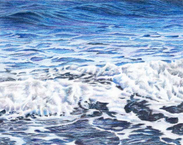
Ocean Blue

Ocean Blue
colored pencil on Rising Museum Board
7.5 x 9.5 inches
©Ann Thompson Nemcosky

Here it is, all finished. I have been looking at it for a couple of days now and am going to leave this one as it is. I am happy with the final result and I would like to do a few more ocean drawings. Every time we are at the beach I use up a ridiculous number of pixels taking pictures of the water and waves. I get captivated with the way the surf moves, expanding and contracting, out and in, and the patterns that are formed as each wave washes the shore. And the way the light at various times of day plays off the water, it's always something different to see. The last time we were at our favorite Edisto Beach the water was an amazing blue, like I had never noticed before. That is what I hoped to capture with my photos, and translate into this drawing. That incredible blue.
And just to show you, this was one of the stages as the drawing was nearing completion. I used ten different blue pencils, along with two purples, a pink, and a warm and a cool gray. As I was developing the darkest areas in the foreground I discovered that even my indigo blue wasn't giving me the depth in those darks that I wanted. So out came one of my favorite pencils, caput mortuum violet. You can see where I began adding it in the lower right portion of the image above. It did the trick too, by deepening and warming those dark areas just enough.
 And here it is again in its final state, same as the image at the top. Thanks for following along as I worked on this one. All of your kind and encouraging comments are so appreciated and help keep me going! Now, what should I draw next?

Tuesday, March 1, 2011

Getting there

Here is my current colored pencil piece, through the next couple of stages. Above you can see where I started getting into that area of the water where the foamy bits begin. The contrast in this area is more stark and pattern like but I had to keep in mind that even though those shapes of foam are very light, they are not the brightest parts of the composition.
Now here is where the tricky part of the drawing begins to emerge. At this point I was really beginning to question the wisdom of my choice of subject matter and my sanity in trying to draw all of this foamy water splashing on the shore. There is little defining shape and the contrast of light to dark areas is much more subtle. I am going to continue on with the darker passages in the foreground (that are just barely blocked in at this point), and then go back to make adjustments in the foamy surf. I will need the reference of those darkest passages where the water washes over the shore in order to see how the values in the rest of the piece should relate to those darkest darks. It's a lot of going back and forth with color and value, but it's slowly getting there!

Sunday, February 27, 2011

Sunday sketches

I haven't posted sketches in a while. How did that happen? Well, here are a couple of recent sketches from my handmade sketchbook. The one above is the view off our back deck, minus lots of tree limbs. I sketched this with pencil and colored pencil, washed with water. It was late in the afternoon. I just love the light that time of day. And recently geese have been flying over in the late afternoons, on their way from the pond in our neighborhood to a pond over on the next hill. Can you hear them honking?
This was a quick watercolor sketch. I couldn't let February get away with sketching tulips.

Thursday, February 24, 2011

Quiet Day

Quiet Day
oil on canvas
6 x 6 inches
©Ann Thompson Nemcosky

While I am working on my latest colored pencil piece, I thought I would go ahead and post another painting for you. This is #55 of my 100 painting project. It is a scene from a nearby walking trail, that follows a river that runs through town. It still doesn't seem right to me, calling these mountain streams "rivers", but they are. Rivers at their start. I guess I'll just never get used to that. They all look like creeks to me.

Sunday, February 20, 2011

Just a peek

This is what's on my drawing board now, the start of another colored pencil drawing. Can you even make out what the subject is? Maybe not. This is about two hours into the drawing, where I mapped in most of the basic shapes in graphite and then began working in colored pencil. I quickly realized that I needed to do some basic mapping with color or else I risked getting seriously lost in the drawing. I am not doing an "under painting" this time as I want to maintain the sparkle of the white board showing through the colors, to keep them as brilliant as possible. After I got all of my blue shapes mapped in I began rendering from the top. Still a long way to go. This one is a little larger than what I have been working recently at approximately 7.5 x 9.5 inches. Should be fun though.

Tuesday, February 15, 2011

Drawing stones

Drawing Stones
colored pencil on Rising Museum board
5.5 x 7.5 inches
©Ann Thompson Nemcosky

Here is what I have been working on lately in colored pencil. A collection of stones, or river rocks, that I originally intended to draw in graphite. Then I realized that I really liked the subtle colors in these stones, so I changed direction and got out my colored pencils.
After I had a basic outline of the stones in graphite on my board, I lightly filled them in with cream and light yellow ochre. I wanted to have an overall warmth to the stones, which is why I chose the warm yellows as a starting point rather than the white of the board. My image above is darkened so that you can see this step, however the cream and yellow ochre were lighter in real life.
Here it is as I began to fill in the colors of the stones. As I moved from one to the next I also went back to previously drawn stones and made small adjustments in color and value.
By now I was really beginning to question my decision to draw these in colored pencil. So many subtle color shifts in each stone. Working on this drawing reminded me of a project that I used to give beginning students back when I taught part-time. It was usually the first project using color that I gave during the course. I would have them bring in a natural object and their objective was to make color swatches of all the colors they could see in that object. Accurately matching color was part of their grade. There were the enthusiastic students that would come in with a colorful autumn leaf, or a dried flower, or a sea shell. Then there were those other students, you know the ones I am talking about, who for whatever reason were intimidated and wanted to choose the easiest object possible for the project, so they would grab a green leaf or a rock from the parking lot on their way to class.

As the students would begin to make their color swatches it wouldn't take long before hands went up for help from the ones with the green leaves or the rocks. The green paint in their tube looked nothing like their leaf or worse, when they mixed their white and black paint the resulting gray didn't even come close to the gray in their rock. So we would start looking, really looking, at their objects, and talk about warm and cool colors, how to mix them, and how to make gray besides using black and white paint. These students with the green leaves and gray rocks would begin to notice that there were a lot more color variations in their objects than they first thought. And oh, did they struggle with what was suddenly a very challenging project.

This is what went through my head as I was drawing these stones in colored pencil. Just when I thought I had all the variations of value and hue represented in one stone I would look again and see something else happening! I was beginning to really feel sorry for all those students that had to struggle with my color project, way back when. Of course, I do realize that they were the ones who probably learned the most from the exercise. Just like I was doing from drawing these stones in colored pencil.
Here it is again in its final state, same image as at the top of this post. I am happy with it now, and glad that I chose to draw this image in colored pencil after all. Maybe I'll chose a sea shell next time.

Friday, February 11, 2011

Fields of Gold

Fields of Gold
oil on canvas
5 x 7 inches
©Ann Thompson Nemcosky

Here is #54 of my 100 painting project. It is a scene from one of those late summer/early autumn days when the goldenrod and asters are in bloom here in our southern mountains. I have always loved those colors.

Tuesday, February 8, 2011

These days

I haven't been working as steadily on my art as I had hoped to be these past several weeks. It's been more hit and miss. Lots of other stuff going on I guess. And I have been doing some other projects that are keeping me busy. And finding things like closets that need cleaning out. And doing a lot of cooking. Well, I always do a lot of cooking but lately I have been experimenting more and baking more.
And reading. I have been absorbed in reading, especially since I got my Nook. Those things are just too cool. And did you know that Barnes & Noble has a free book every Friday for the Nook? Now I am never going to get through my reading list.

Thursday, February 3, 2011

The way back

You know I mentioned at the beginning of the year that I was stalled in my 100 painting project and was looking for a way to get back into it again. Because it is a project that I would like to see through to its completion. So anyway, about a week ago I was visiting the blogs of some of my favorite artists and I came across this post and this post on Barbara Newton's blog, Barbara Newton Art Journal. I have long admired her pastel landscapes and was fascinated when she explained her method of doing thumbnails to jump start her painting process.

Now, I have always known that doing thumbnails is a good idea, for working out things like composition and maybe even color relationships. It's just that I hardly ever do them. I do use my camera as an extension of my sketchbook, and tend to make a lot of adjustments in Photoshop to the images that I ultimately use as reference. And as a result I tend to skip the actual drawing of a thumbnail step. Which works okay, except that when working from a photo I can sometimes get all caught up in the details and lose sight of some of the qualities that attracted me to the image in the first place. So when I saw Barbara's post, it was an "Aha" moment for me. This may be just the approach I need to get back into my painting project and move it forward.

I opened one of my picture files, sat in front of my computer screen and scribbled with my Neocolor II water soluble crayons into six boxes I had drawn onto watercolor paper. I did these very quickly, wanting to only get my initial reaction to the images. Then I took the page to my drawing table and brushed on water, adding more color here and there, without looking at the original references. I was just reacting to what was already on the paper. Once it dried, I scanned my thumbnail page (shown above) and created a copy in grayscale (shown below).
Here you can see my first two attempts of painting directly from my thumbnails, as well as the original thumbnail page and the grayscale copy for value reference. I did make my thumbnails a bit larger than Barbara Newton's. After I try a couple more paintings from this set I would like to attempt this process again, making the thumbnails much smaller, in order to distill the imagery even further. It's a way back into painting with a process that may just work for me. I still have three more previously completed paintings to post before I get to this new group, but I'll keep you posted on how this method is working out.

LinkWithin

Blog Widget by LinkWithin